As designers, we have many tools to help communicate our message. In previous posts, we have covered the basics of typefaces and typographic hierarchy. Today, we will delve into one of our most powerful tools—colour. Colour is an instant mood creator. It can evoke emotions, shape perceptions, and grab attention in seconds. Considerate colour choices can boost your message, create a visual flow, and help seamlessly guide your viewer's experience.
What is Colour Theory All About?
Colour theory is the science behind the art of using colour. It helps to describe how different colours relate, whether in gentle harmonies or clashing contrasts.
The colour wheel, a visual map of how colours correspond, is at the heart of colour theory.
The first points on the wheel are the Primary Colours: Red, blue, and yellow. You can't mix other colours to get these.
If you mix two primary colours, you create the secondary colours—green, Purple, and Orange. Blue and Yellow make Green, Red and Blue make Purple, and Yellow and Red make orange.
The tertiary colours sit between and are combinations of primary and secondary colours. For example, a primary colour, such as yellow, and a secondary colour, such as green, mix to create yellow-green.

Now that we have completed the colour wheel, we can use it as a tool to create colour ways. If the colours in a colour way work well together, we call this harmony.
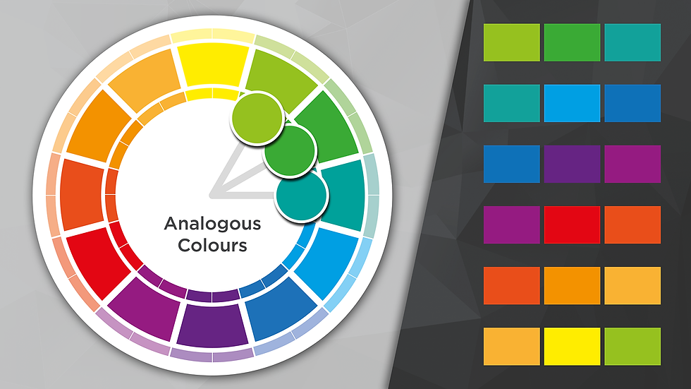
The most straightforward harmonies are called Analogous Colours. These groups sit alongside each other on the colour wheel; there isn't much contrast, and the grouping feels smooth.

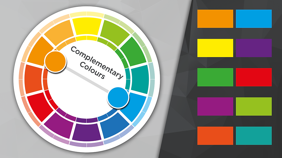
The following way to group colours is in Complementary Pairings. Suppose you choose any point on the colour wheel and imagine a line from there passing through the centre of the wheel. In that case, the point directly opposite where that line touches the wheel again is the complementary colour of the one at the original point. These colours will contrast well, make each other pop, and always stand out.

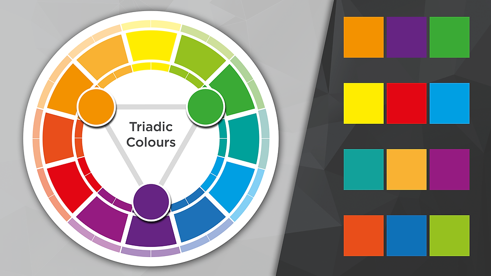
The next way is a Triadic group. Three evenly spaced colours on the wheel create a balanced but vibrant combination.

Tapping into emotions
Colours aren't just visual elements; they can evoke many emotions and associations. Red often conveys passion, urgency, and excitement, while blue is synonymous with calm, trust, and professionalism. Yellow brings a sense of optimism, warmth, and caution, and green is strongly tied to nature, health, and tranquillity. Purple exudes creativity, luxury, and sophistication, whereas orange radiates enthusiasm, attention, and creativity. Black represents power, elegance, and mystery, while white signifies purity, simplicity, and peace. Each colour carries its own emotional weight, making thoughtful colour choices essential in creating impactful designs.
Corporate websites often rely on blue as a primary colour, as it conveys trust and professionalism. Headlines are typically rendered in darker shades of blue to maintain focus. At the same time, the body text is kept neutral for readability. E-commerce sites, on the other hand, favour red or orange for call-to-action buttons, leveraging their ability to create a sense of urgency and drive clicks. Creative agencies take a bolder approach, using vibrant, contrasting colours to emphasise creativity and innovation while maintaining neutral tones for body text to ensure readability. In the health and wellness sector, green and blue dominate, as these colours evoke feelings of calmness, tranquillity, and a connection to nature. Each sector tailors its colour choices to resonate with its audience and purpose. Think of how a red SALE sign creates urgency or how a blue bank logo feels trustworthy. These emotional cues are no accident—they result from deliberate colour choices.
How to Use Colour in Typography
Now that we've explored how industries use colour, let's look at how you can apply these principles to your typography. Colour is a powerful tool in your use of typography and can be a key part of defining visual hierarchy (see our blog about this here). It's all about making the text readable, eye-catching, and emotionally engaging.
Here are a few tips on how to use colour effectively in your type:
Make It Readable: Always ensure enough contrast between your text and background. High contrast is key to keeping your text legible, whether it's a white font on a dark background or bold headlines against muted tones. Avoid clashing colour pairings that strain the eyes—legibility first, aesthetics second.
Guide the Eye: Colour is a powerful tool for directing attention. Use it strategically to highlight key information, like headlines or call-to-action buttons, by choosing a colour distinct from your body text. Establishing a clear colour hierarchy across your design makes navigation intuitive—think bright, bold colours for important info and subtler tones for secondary content.
Match the Emotion: Colours carry emotional weight, so pick shades that align with your message. Calming blues and greens are perfect for trust and relaxation, while vibrant reds and oranges can energise and excite. Don't forget to consider your brand's palette—ensure any colour choices fit seamlessly with your brand identity. And always think about context: colours can mean different things to different audiences or cultures, so tailor your palette accordingly.
Colour and emotion are vital players in the world of typography and design. By understanding how to apply colour theory and tap into the emotional power of colour, you can create designs that aren't just nice to look at but also compelling and impactful. Whether you're trying to make a headline jump off the page or set a calm tone with your body text, the right colour choices can make all the difference.
So, the next time you start a design project, don't just think about what looks good—how your colours make people feel. Ultimately, design is more than just visuals; it's about connecting with your viewer.

Comments